Three new panels just landed in the JMeterHub JTL Analyzer — all free, all running entirely in your browser. Load a .jtl file (or hit Try it with sample runs) and they show up right away.
1. Slowest transactions
A top-5 card sits directly under the run summary and ranks transactions by 95th percentile response time. Each row shows a relative bar plus average, max, sample count and error rate, so the worst offender in a run is the first thing you see — no sorting, no scrolling through the aggregate table.
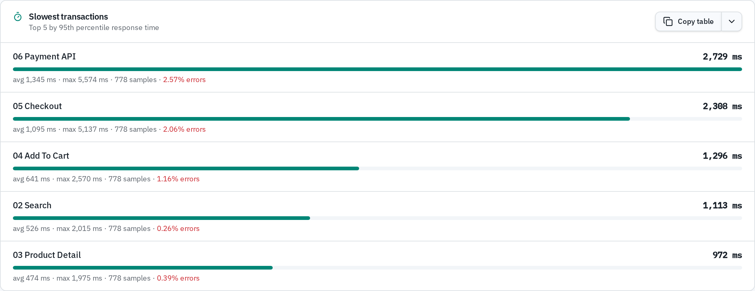
Like every table in the analyzer, it has its own Copy table button with Markdown, HTML, CSV and TSV output for Confluence or Word.
2. Group errors by type
The Errors table now has a Group by error type checkbox. Instead of one row per transaction, failures are clustered by the actual error (for example 500 – Internal Server Error) with the affected transactions, the total count, the share of all errors and the share of all samples.

This answers the question you actually care about after a failed run: is this one broken endpoint, or one broken dependency hit from five endpoints? All existing filters — comma-separated terms and Not contains — keep working in the grouped view, and the copy button exports exactly what is on screen.
3. Throughput over time
A new chart plots successful and failed requests per second across the run, stacked so total load and the failure share are readable at a glance. Ramp-up shape, throughput plateaus and error bursts line up on the same timeline as the response time chart above it.
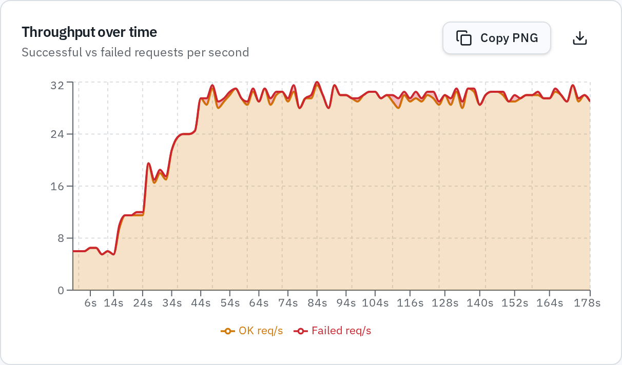
As with every chart, Copy PNG puts it on your clipboard with the title and colour legend baked in, ready to paste into a report.
Try it
Open the JTL Analyzer and click Try it with sample runs — a baseline and a regression run load instantly so you can explore all three panels without your own data.
Persistence, PDF export, AI-written conclusions and custom SLA thresholds remain part of Pro; everything above is free and always will be.